Main Index : Reference :
A dialog resource contains instructions for how to place the GUI elements of for example a dialog. Each dialog resource file must be named dlgname.res and be placed within the dialogs folder of the res folder in the plugin directory. The file should be structured like this:
DIALOG dlgname // Like the filename without ".res"
{
  [Dialog elements and groups...]
}
The dlgname identifier must also be an enum value in the file c4d_symbols.h within the res folder in the plugin directory. Please see this page for more information about dialog layout.
The layout of the dialogs in C4D is dynamic. That means that one doesn't specify the exact position of an element but rather its relation to other elements. This ensures that the dialogs are resolution independent and allows for easy scaling of the whole layout.
As a rule of thumb, C4D always ensures that a dialog element gets at least the space that it has requested. This can either be a manually specified size or the minimum size of the component. For most dialog elements one can additionally specify how they should behave if they are to be placed within a space that is larger than their minimum size. These are the possible flags:
| Layout flag | Explanation |
FIT_V |
Fit the element vertically |
FIT_H |
Fit the element horizontally |
CENTER_V |
Center the object vertically |
CENTER_H |
Center the object horizontally |
ALIGN_LEFT |
Align the object left |
ALIGN_RIGHT |
Align the object right |
ALIGN_TOP |
Align the object on top |
ALIGN_BOTTOM |
Align the object on bottom |
SCALE_H |
Allows the parent to scale the element horizontally |
SCALE_V |
Allows the parent to scale the element vertically |
For elements that support them, they are listed as [LAYOUTFLAGS] below.
Some elements support the option to specify their size manually. This is done using the flag:
| Flag | Explanation |
SIZE width, height |
Specify the size manually |
Negative values of width and height specify absolute pixel values. For example SIZE -100,-20 means 100 pixels wide and 20 pixels high. Positive values specify the width in 1/10ths of a character and the height in 1/10ths of a line. So SIZE 100,10 gives an element that is ten characters wide and one line high. A height or width of 0 means the default or minimum size of the element.
The manual sizing option is listed as [SIZE] below.
The names of tabs or groups and the texts of static text fields or buttons are specified using the flag:
| Flag | Explanation |
NAME strid |
Element name or text |
strid should be an identifier from the string resource file that belongs to the dialog, dlgname.str. The identifier must also be listed as an enum in the c4d_symbols.h file. One cannot specify a string directly. This assures that all text within a dialog can be localized.
The name option is listed as [NAME] below.
All elements in a dialog that need to be reference in any way should be given an id. This can either be just an integer or, more recommended, an enum value from the file c4d_symbols.h within the res folder in the plugin directory.
GROUP [id]
{
  [Flags]

  [Sub-elements]
  ...
}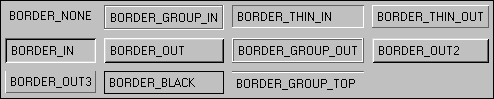
A group is used to place several elements into a tidy grid. One can either have an invisible group or add a border around it. Groups are also useful to enable and disable several elements at a time. Just use the Enable() function of GeBaseDialog with the id of the group.
The following are the possible flags for groups:
TAB [id]
{
  [Flags]

  GROUP
  {
    [1st page]
  }
  GROUP
  {
    [2nd page]
  }
  ...
}
A tab group is used to group several sub-groups into one, allowing the user to change between them using tabs. One can also use a popup button or radio buttons instead of tabs. The name of each page's tab is taken from the name flag of the group.
The following are the possible flags for tab groups:
| Flag | Explanation |
[LAYOUTFLAGS] |
Layout flags |
SELECTION_NONE |
No tabs |
SELECTION_TABS |
Normal tabs |
SELECTION_CYCLE |
Popup button instead of tabs |
SELECTION_RADIO |
Radio buttons instead of tabs |
SEPARATOR [id]
{
  [Flags]
}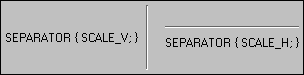
This is a line separator element, like the one used in the material editor of C4D. The orientation of the separator is specified with the following flags:
| Flag | Explanation |
SCALE_V |
Vertical separator |
SCALE_H |
Horizontal separator |
DLGGROUP
{
  [Buttons]
}
The dialog group element contains the standard buttons of a modal dialog (OK and Cancel). By having these grouped together in a single element, C4D can change the ordering and alignment of the buttons to suit the operation system used. Use the following flags to specify which buttons are shown:
| Flag | Explanation |
OK |
Show the OK button |
CANCEL |
Show the Cancel button |
EDITTEXT [id]
{
  [Flags]
}
Edit text fields are used for one line text input. The following are the possible flags for an EditText element:
| Flag | Explanation |
[LAYOUTFLAGS] |
Layout flags |
[SIZE] |
Manual size |
MULTILINEEDIT [id]
{
  [Flags]
}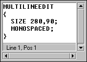
The MultiLineEdit field is used for text input on several lines, like the C.O.F.F.E.E. expression editor. The following are the possible flags for MultiLineEdit elements:
| Flag | Explanation |
[LAYOUTFLAGS] |
Layout flags |
[SIZE] |
Manual size |
[NAME] |
Name |
MONOSPACED |
Monospaced font |
SYNTAXCOLOR |
C.O.F.F.E.E. syntax highlighting |
STATUSBAR |
Displays a statusbar with the cursor position |
STATICTEXT [id]
{
  [Flags]
}
Static text fields are used for text labels. The following are the possible flags for StaticText elements:
| Flag | Explanation |
[LAYOUTFLAGS] |
Layout flags |
[NAME] |
Text |
[SIZE] |
Manual size |
EDITNUMBER [id]
{
  [Flags]
}
Edit number fields are used to input numeric values. The following are the possible flags for EditNumber elements:
| Flag | Explanation |
[LAYOUTFLAGS] |
Layout flags |
[SIZE] |
Manual size |
EDITNUMBERARROWS [id]
{
  [Flags]
}
EditNumberArrows is like EditNumber but with a pair of scroll arrows. The following are the possible flags for an EditNumberArrows element:
| Flag | Explanation |
[LAYOUTFLAGS] |
Layout flags |
[SIZE] |
Manual size |
SLIDER [id]
{
  [Flags]
}
Sliders are used to input numeric values within a certain range. The following are the possible flags for slider elements:
| Flag | Explanation |
[LAYOUTFLAGS] |
Layout flags |
[SIZE] |
Manual size |
EDITSLIDER [id]
{
  [Flags]
}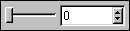
EditSliders are like regular sliders but show their current value in an editnumber field as well. The following are the possible flags for EditSlider elements:
| Flag | Explanation |
[LAYOUTFLAGS] |
Layout flags |
[SIZE] |
Manual size |
CHECKBOX [id]
{
  [Flags]
}
Checkboxes are used for boolean options. The following are the possible flags for checkbox elements:
| Flag | Explanation |
[LAYOUTFLAGS] |
Layout flags |
[NAME] |
Text |
[SIZE] |
Manual size |
RADIOGROUP [id]
{
  [Flags]

  GROUP
  {
    [Group flags]
    [Radiobuttons]
    ...
  }
}
A radio group is used to place radio buttons in a grid and make sure that only one button at a time is active. The radiobuttons are added within a regular Group inside the radio group, using RadioGadget. The following are the possible flags for radio groups:
| Flag | Explanation |
[LAYOUTFLAGS] |
Layout flags |
RADIOGADGET [id]
{
  [Flags]
}
Radio gadgets are used to add radio buttons to RadioGroup elements. The following are the possible flags for a RadioGadget element:
| Flag | Explanation |
[LAYOUTFLAGS] |
Layout flags |
[NAME] |
Text |
[SIZE] |
Manual size |
BUTTON [id]
{
  [Flags]
}
Adds a button. The following are the possible flags for button elements:
| Flag | Explanation |
[LAYOUTFLAGS] |
Layout flags |
[NAME] |
Text |
[SIZE] |
Manual size |
ARROWBUTTON [id]
{
  [Flags]
}
Adds a small button with an arrow icon. The following are the possible flags for ArrowButton elements:
| Flag | Explanation |
[LAYOUTFLAGS] |
Layout flags |
[NAME] |
Text |
[SIZE] |
Manual size |
ARROW_LEFT |
Arrow pointing left |
ARROW_SMALL_LEFT |
Small arrow pointing left |
ARROW_RIGHT |
Arrow pointing right |
ARROW_SMALL_RIGHT |
Small arrow pointing right |
ARROW_UP |
Arrow pointing up |
ARROW_SMALL_UP |
Small arrow pointing up |
ARROW_DOWN |
Arrow pointing down |
ARROW_SMALL_DOWN |
Small arrow pointing down |
COLORFIELD [id]
{
  [Flags]
}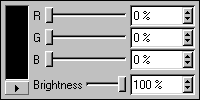
Color fields let the user choose a color using the standard C4D control as well as the operating system dialog. The following are the possible flags for ColorField elements:
| Flag | Explanation |
[LAYOUTFLAGS] |
Layout flags |
[SIZE] |
Manual size |
NOBRIGHTNESS |
Disable the brightness control |
NOCOLOR |
Disable the color controls |
If both NOCOLOR and NOBRIGHTNESS are used, no sliders are displayed.
COMBOBOX [id]
{
  [Flags]

  CHILDS
  {
    [Child 1]
    [Child 2]
    ...
  }
}
Combo boxes let the user choose among several items in a popup menu. The following are the possible flags for a ComboBox element:
| Flag | Explanation |
[LAYOUTFLAGS] |
Layout flags |
[SIZE] |
Manual size |
The children are listed within the CHILDS group (please note the spelling!). Each child should be formatted like this
id, stringidentifier;
where id is either a number or an enum from c4d_symbols, and stringidentifier is an identifier from the string resource file that belongs to the dialog.
POPUPBUTTON [id]
{
  [Flags]

  CHILDS
  {
    [Child 1]
    [Child 2]
    ...
  }
}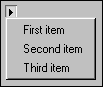
Popup buttons are like combo boxes in that they let the user choose among several items in a popup menu, but they don't display the currently choosen item. The following are the possible flags for PopupButton elements:
| Flag | Explanation |
[LAYOUTFLAGS] |
Layout flags |
[SIZE] |
Manual size |
The children are listed within the CHILDS group (please note the spelling!). Each child should be formatted like this
id, stringidentifier;
where id is either a number or an enum from c4d_symbols, and stringidentifier is an identifier from the string resource file that belongs to the dialog.
USERAREA [id]
{
  [Flags]
}
A UserArea element represents a GeUserArea object. It can show whatever the plugin programmer wants and can be used to make custom controls. The following are the possible flags for UserArea elements:
| Flag | Explanation |
[LAYOUTFLAGS] |
Layout flags |
[SIZE] |
Manual size |
The id used above must be the same as the one used to create the GeUserArea object in the C.O.F.F.E.E. code.
SCROLLGROUP [id]
{
  [Flags]

  GROUP
  {
    [Sub-elements]
    ...
  }
}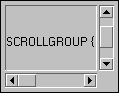
Scroll groups let you create scrollable panes in the layout. The elements of the pane are normally placed inside a group within the scroll group, but a single element (e.g. a UserArea) can be placed directly within the scroll group. The following are the possible flags for ScrollGroup elements:
| Flag | Explanation |
[LAYOUTFLAGS] |
Layout flags |
[SIZE] |
Manual size |
SCROLL_V |
Allows the group to scroll vertically |
SCROLL_H |
Allows the group to scroll horizontally |
SCROLL_BORDER |
Displays a small border around the scroll group |
SCROLL_STATUSBAR |
Creates a status bar for the scroll group |